Copper Sulphate house


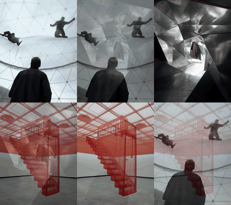
Psycho Buildings exhibitionSomehow art and houses just seem to go together now. There was Rachel Whiteread’s inverted housespace sculptures, the recent Psycho Buildings exhibition at the Hayward Gallery, and then there was Seizure, the Copper Sulphate house in Elephant and Castle.

Roger Hiorns’ crystal house is probably the maddest of them all, a entire council flat flooded with copper sulphate solution, which is left to crystalise before being drained. It’s a very weird experience, a bit like entering Narnia through the wardrobe. First you wander down from Elephant and Castle, home to the most un-shopping centery shopping centre, along the New Kent Road, whose council blocks now appear to be little more than facades for this year’s incarnation of futuristic local authority bruto-chic, until you find the most boarded up two storey horseshoe shaped set of flats you can. You then stand there for an hour waiting for your turn to try on a set of some old geezer’s gumboots, before joining another queue to actually get into the flat. If you didn’t know better you’d think that there was some kind of secret stalinist indoctrination going on, an artistic linkage of the queuing process and the rotten environment you’re locked into.

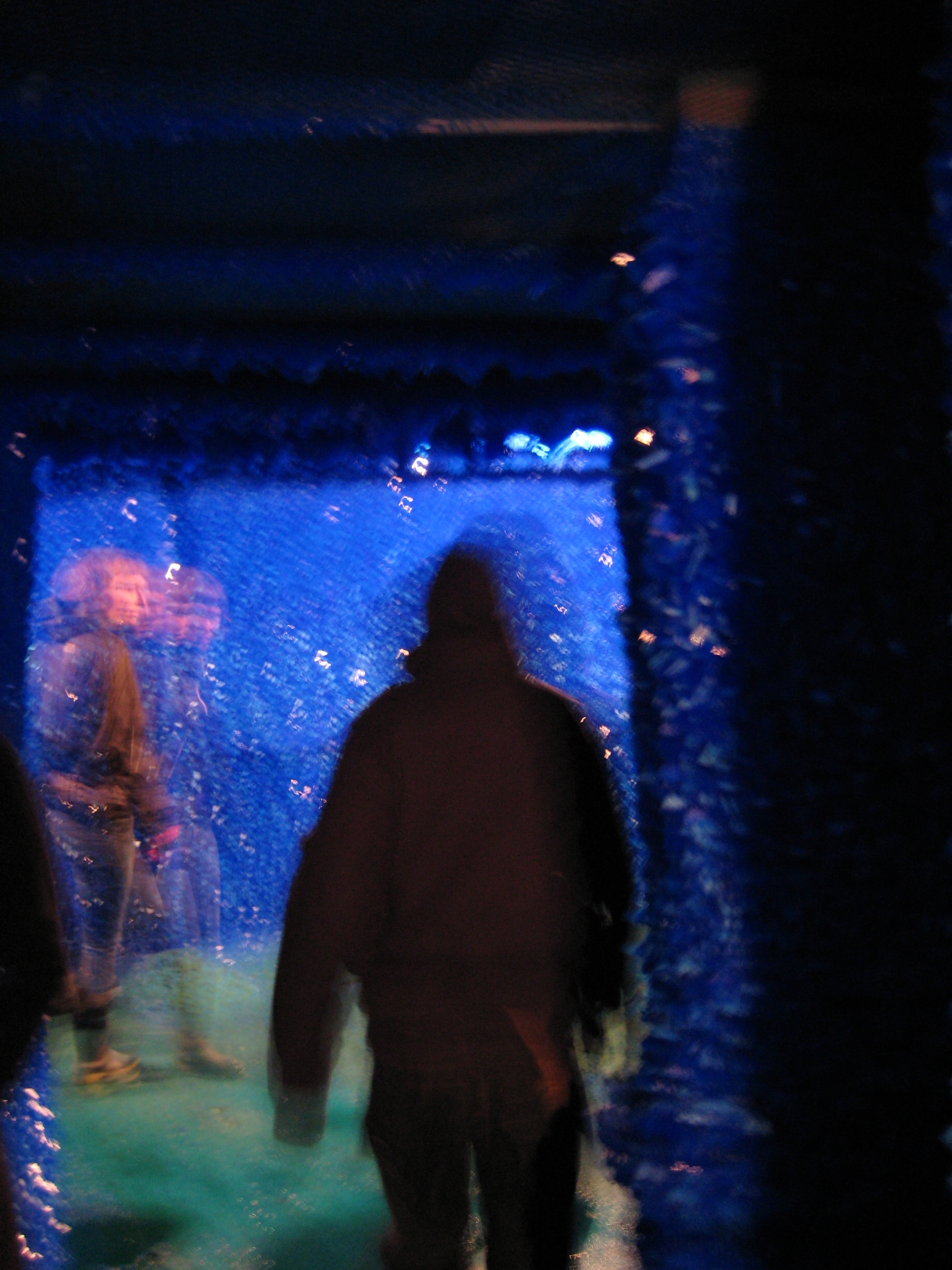
Very, very blueFinally you go in and it’s a complete transformation. You enter the flat, turn left and the grime and festeridge of the estate is obliviated by walls of massive, compellingly blue copper sulphate crystals. It’s like someone has been pebbledashing with some poor child’s science project, but on an industrial scale. The walls aren’t just covered in the crystals, they’re caked in them, like a ship’s hull that’s been overwhelmed with barnacles. And they’re everywhere. And they’re all blue. As gobsmackingly blue as the diva in The Fifth Element.

It’s like a twisted Santa’s Grotto, all sparkley and gem-like and bloody cold too the day I went to see it. You stumble around in what could either be Blue Santa’s elves’ urine or more likely undrained copper sulphate runoff (hence the gumboots), while indiscriminate shapes of other visitors fade in and out of view. And you find yourself gazing into individual hunks of fist sized crystal mummuring ‘mmmm, my precious’ over an over like a demented Gollum. The overall effect is a bit like being entombed in one of Joseph Beuys’ huge felt installations, where all sound and sensation have been damped out of existance. Standing inside a Beuys installation was the nearest thing to being down a mine, said Arthur Scargill in possibly his only genuinely coherent moment. Standing here is even closer, because unlike a wall-full of felt, it actually looks like you could mine something here.
People drifting in and out

It’s the sort of thing that makes you wonder why there isn’t more of this stuff, or indeed, why they’re demolishing this at the end of the month. It’s the exact opposite of Whiteread’s internal spaces, which solidified the spaces inside a building, but prevented you from entering them. This concretises the surroundings (or more accurately, copper sulphatises them), allowing you to move around, but at the same time shows you a barren, poisonous, thoroughly alien landscape within that forces your mind to think about the nature of the space. Awesome.


300 years later…


Yeah, poor form to have ignored the whole of September I know. But it wasn’t such a class act as it turned out. Anyway, there I was thinking that Watchmen sounded like a really good film adaptation of a really, really good comicbook, so I decided to check out 300, Zack Snyder’s last comicbook revision.

I also decided to try using iTunes’ music store to actually buy it (it was a slow day, I was bored, it was only about a fiver). As far as the store goes it’s not bad at all – downloaded fast, slipped easily onto my iPhone (so I can watch it on the train going ‘THIS IS SPARTA’ as commuters look at me in a combination of awe and repugnance) and so far it hasn’t worried too much about being migrated all over the place.

As far as the film goes, stylistically it’s great, way more effective than Sin City, and manages to combine a sort of comic super-reality with some kind of emotional connection, which again Sin City just never accomplished. And it has many good bits, not least The Wire’s Dominic West once again playing a deceitful womanising political whore and David Whenham once again playing a grovellingly obsequious sidekick. And it does have that sense of super-realism that started to come in vogue with The Matrix and colour timing and really great greenscreen work. It also works as a story.

But no matter how good it is, Ridley Scott’s Gladiator still shits on it. Visually way more expansive, better story, better plot, better acting, more emotionally engaging and it even has better lines. So while 300 gives us “Give them nothing, but take from them everything”, Gladiator gives us “What we do in life echoes in eternity”.

Still looking forward to Watchmen though.


Who Watches The Watchmen?


After the crushing depression that was Wanted and the realisation that, Dark Knight aside, pretty much all comic book movie adaptations were going to be a disappointment to me, I was really pleased to find this trailer for Watchmen.

Previously thought to be utterly unfilmable, the movie has already chewed its way through a host of directors, stars, locations and studios. Now it’s finally being put together by the guy who directed 300 – not that that is any kind of a recommendation. Based on this trailer though I can’t wait.

I guess one thing this, Sin City, 300 and Frank Millar’s new movie The Spirit show is that maybe there is a third way for superhero comic book adaptations to go given that they don’t often make great films. The third way of hyper-real visuals, phenomenal amounts of greenscreen and a focus on the key moments within the comics. There is a precedent for this in The Matrix, which borrowed heavily not just from comic books (check out the work of Geoff Darrow), but from Japanese anime like Ghost In The Shell right down to duplicating specific frames.

It’s a method that balances the apparent paucity of the comic book medium (there’s less depth in the average Fantastic Four storyline than in your average B movie) with the need to be somehow more stylish than most films.


Creativity 102


This is the slideshow of the How To be Creative manifesto.
Sorry that there appears to be a really crap thing saying that you can print this that happens to obscure some of the bottom left hand side. So you’re probably better off looking at the full pdf on the Change This site.

Creativity 101


I’ve been getting interested in exactly what creativity is and what you can do to develop it within organisations. In particular, is creativity something that is just there innately, or can you nurture it so as to become more creative, both as an individual and an organisation. And, if so, what we can do to build and maintain spaces and environments that are most conducive to creativity.

The most thought provoking piece I’ve found so far is a How To Be Creative manifesto by Hugh MacLeod. This video is inspired by the core elements of the manifesto, but the whole thing is worth reading.


My Wordle


I’m just curious as to where TB came from. But now I know, it’s from the text message Euro 2008 conversation between me and the Brother.

This is a little word picture of the blog as ‘interpretated’ by Wordle. It’s a toy for generating “word clouds” from text that you provide. The clouds give greater prominence to words that appear more frequently in the source text. You can tweak your clouds with different fonts, layouts, and color schemes. You can see more 1930s style word art at wordle.net