| Mar 16 |
Archive for March 16th, 2011Great Info Graphic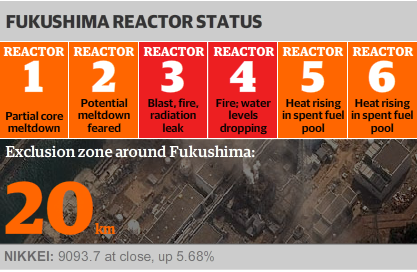 Excellent info graphic from the Guardian for the state of play of the Fukushima nuclear plant. I love the use of the Food Agency inspired colour coded risk levels. Quick and informative, which is the key for graphics like this, but I can’t help feeling that it’s peaked a little early. As Shakespeare says (admittedly in Shakespeare In Love), if you start out so high where do you go when you meet the love of your life? What colour do you go to if everything goes seriously wrong? Black? And should the graphic start flashing like a Star Trek warning alarm? Alternatively, does it actually get much worse than ‘Blast, fire, radiation leak’? At that point I’m definitely running. |